We reached a checkpoint!
While developing and self publishing our previous game (Nanuleu) we learned a lot of things.
We learned many technical skills but more importantly we learned about the game business. We wrote to gaming sites, youtubers and influential gaming people. Most of them didn’t write back, but the few that replied, helped us promote our game.
We also learned that it is possible to make a living by making games, which is something that has been very difficult in our country. Now we hope that more people will get encouraged to pursue a career in game development without having to go live abroad.
We founded our own company and learned all the the legal procedures to get paid from several stores and pay the required taxes.
Nanuleu wasn’t a staggering financial success, but we got enough to cover our expenses and to get started with our next game.
The game concept
After making Nanuleu (which is a strategy game) we wanted to try something with more action and speed, and this time we were going to focus solely on mobile platforms.
We wanted the controls to be simple and easy to understand while allowing for interesting gameplay. We also wanted to have different modes so the game would swap between them, like mini games.
We started with the idea of a vertical runner/shooter with obstacles that the player had to shoot.
We used only two buttons, one at each side of the screen. With a tap on a button you moved to that side and shot a laser at the obstacles.
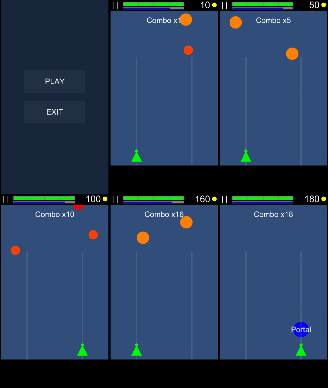
The gameplay wasn’t fun, but we really liked how the two button input felt, so we decided that we would try to come up with interesting mechanics for this form of input.
We started brainstorming more ideas and trying them out. We tried making the obstacles appear with a rhythm so the game would feel better but it didn’t worked for us, trying different combinations on the waves, using bullets instead of a laser and so on, but nothing felt right.
We like to play shooter games, but on mobile devices we never liked how moving your finger around the screen blocks the sight. Also having many buttons to use powers or moving around is difficult and can cause frustration to the player.
We thought the two button input could fit the genre if we managed to make the experience fun with only two actions. We also wanted something less overwhelming than a bullet hell shooter.
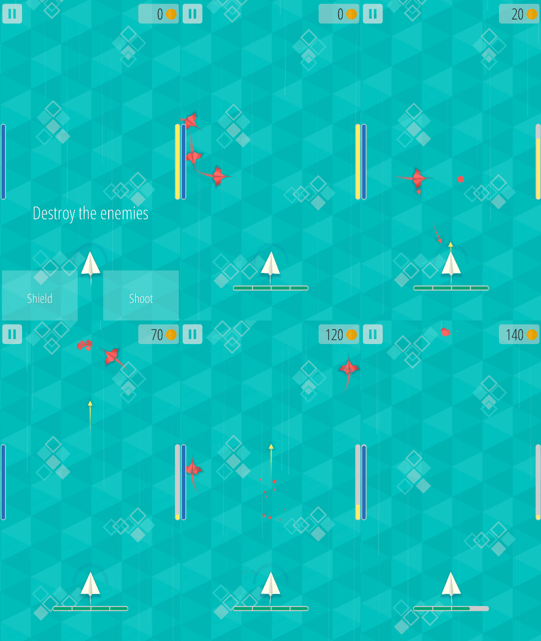
So we decided to add a shield to the ship. With the right button the ships shoots a bullet and with the left button the ship activates a shield. The shield bounces off any bullet that touches it.
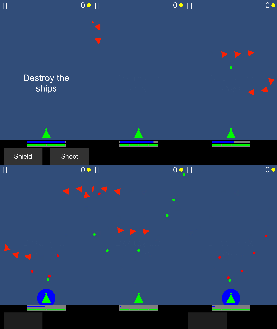
The gameplay felt good and we thought it had potential if the patterns of enemies were finely tuned and we added enemies with different behaviours. So we decided to continue development of this mechanics.
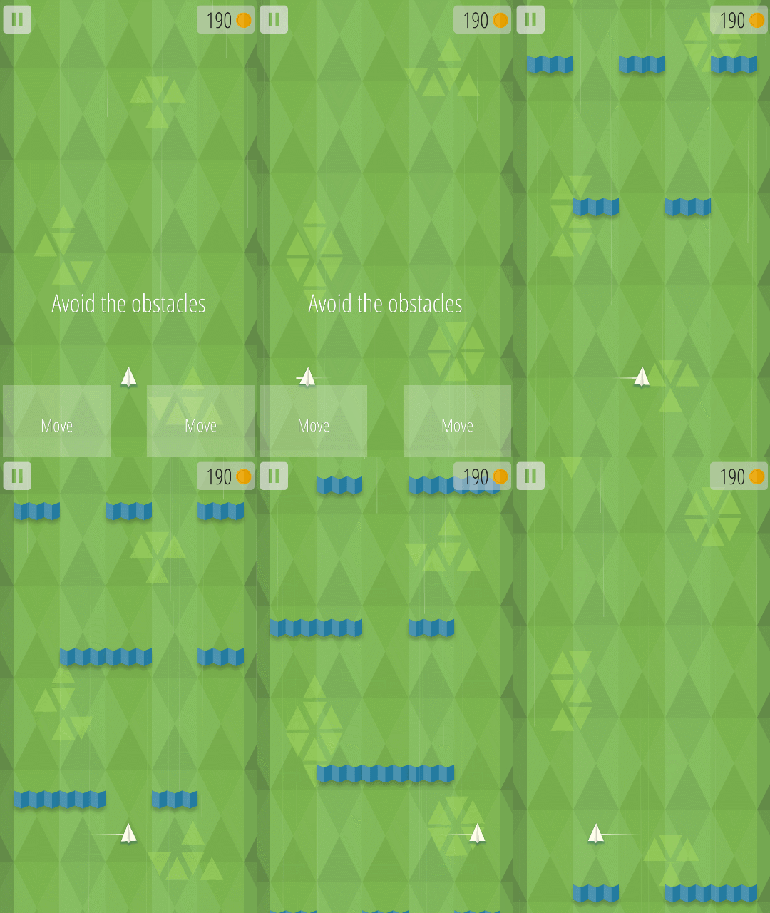
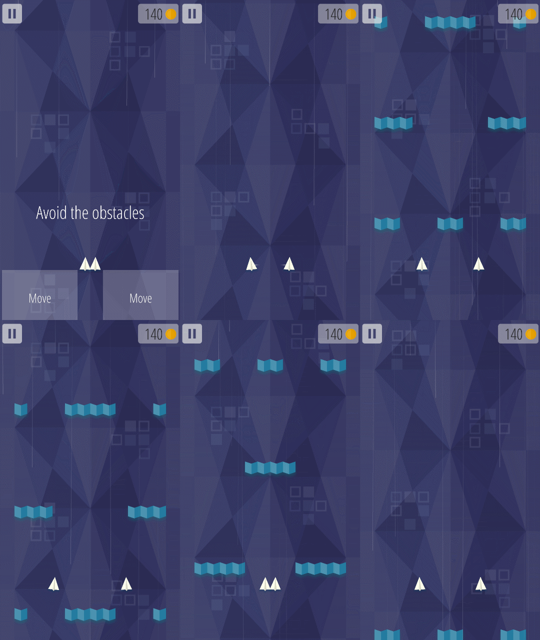
We also worked on the minigames that would appear every time the player finished a level. In total we added three minigames. Each has a different mechanic but with the same input.
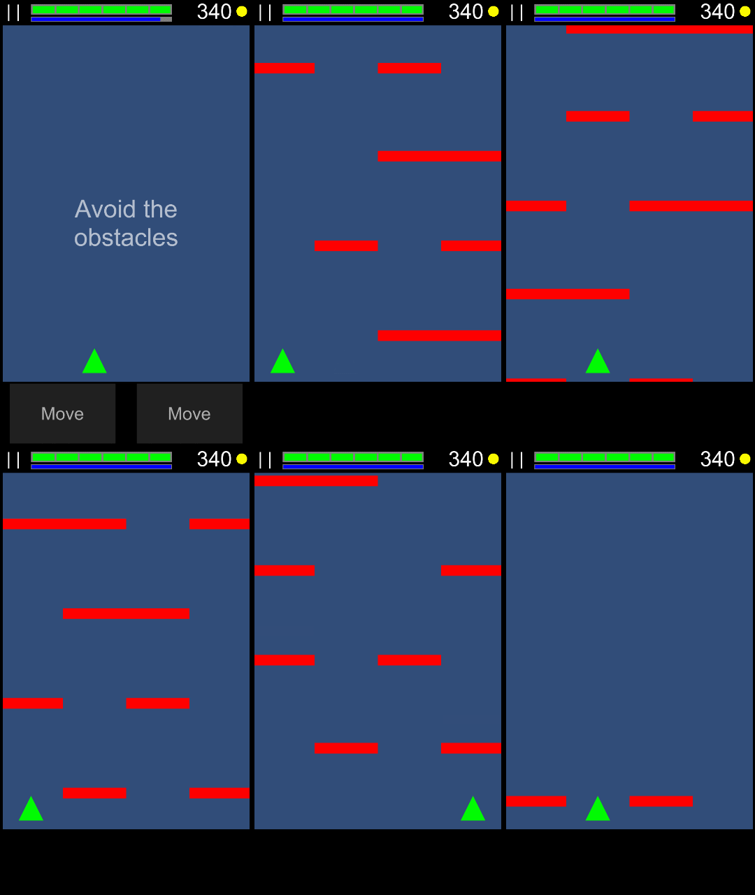
Dodge mode
The player moves a fixed amount of space in the direction pressed. Obstacles come from the top.
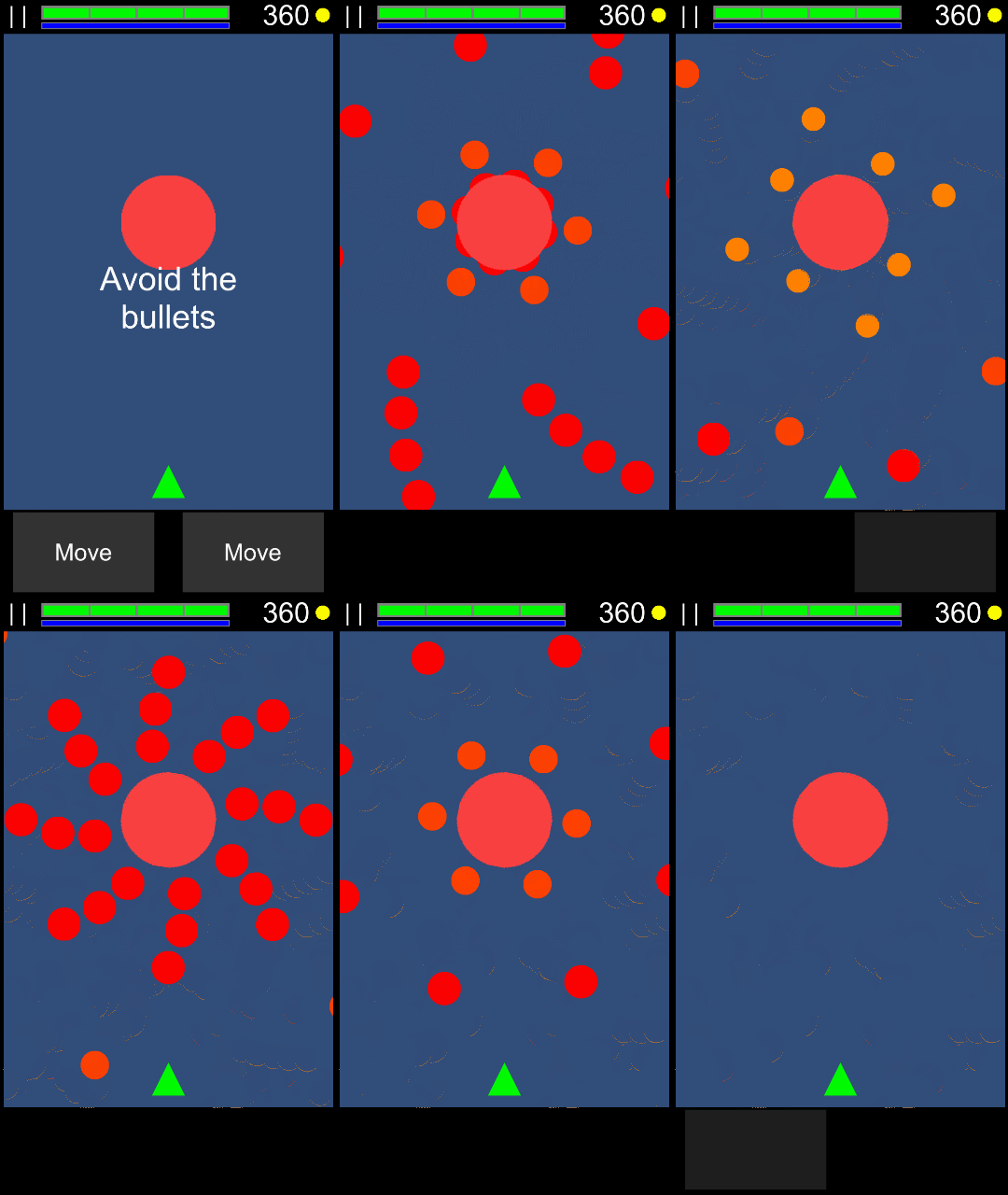
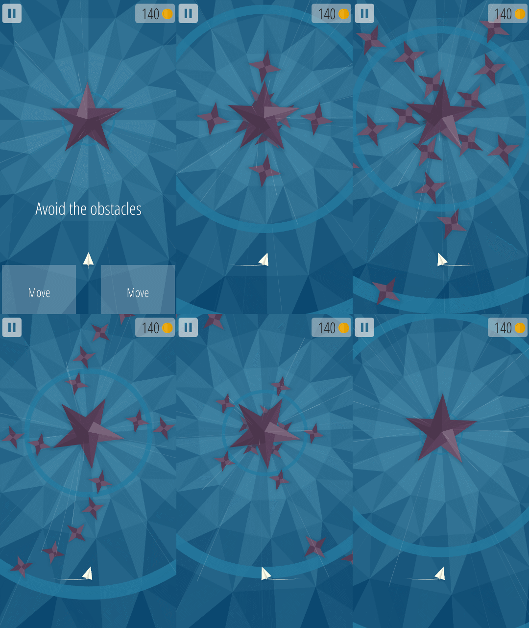
Circle mode
The player rotates around a center in the direction pressed. Obstacles come from the center and spread outward.
Mirror mode
The player moves two ships at the same time. Left button make the ships get closer and the right button makes the ships get farther. The obstacles come from the top.
Shield energy, Ammo and the HUD
Initially we only had one resource: Energy. When the player used the shield or shot a bullet it would consume some energy. However after testing it for a while we decided to split the resource and have ammo for shooting and energy for the shield.
At the beginning we had the health and energy displayed at the top of the screen. We showed the game to our friends at our local gamedev community and they pointed out that they didn’t pay attention to the top of the screen because everything was happening in the middle and bottom.
So we decided to move everything to the bottom. We encountered another problem, there was no relation between the energy bars and the action, so the players didn’t understand what each resource did.
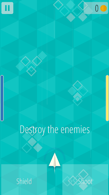
We moved the energy bar (blue) to the left side, because that’s what the shield (left button) uses, and the ammo bar to the right side because that’s what the bullets use (right button). And we left the health bar below the ship. This seems to be a good approach since now players quickly understand what resources belong to each action.
Progression
From the beginning we wanted this game to be premium, because that’s what our previous game was and that’s the kind of games we like to make and play.
We want our game to have between 5 to 8 levels and a final boss. After the player finishes the game, we could unlock a game+ mode with a higher difficulty.
We like how games like Downwell handles progression, so we tried to adapt it to our game.
Each time the game starts, the player starts from the beginning, with no power ups or upgrades but the player can choose a style that changes the game in some way.
Standard Style
The default style
Laser Style
Shoots a laser instead of bullets. Uses more ammo. In this style it’s easier to aim because the laser hits the enemies instantly when the button is pressed.
One Dimension Style
No mini games, but the main levels are slightly longer.
Patient Style
Enemies stay longer before leaving. This style gives players more time to destroy the enemies so they don’t lose the coins.
Each time a game ends, all the coins gathered are used to unlock new styles or new ships. Ships are cosmetical and don’t change the gameplay.
The game is divided in levels, and each level is divided in 4 sections. At the end of sections 1-3 there is a shop where the player can buy upgrades and heal some of the ship’s health.
To buy each upgrade a specific amount of coins is required. Coins are collected automatically after destroying an enemy. Enemies stay on the screen a short time and if they are not destroyed they leave the screen and take the coins with them.
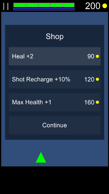
After the end of section 4 of each level, the player can choose between 3 of the following power ups.
Double Reflect
Shield reflects an additional bullet
Exploding Enemies
Enemies create bullets when killed
Double Hit
Bullets hit two targets
Double Wall Damage
Double damage against walls
Reduced Shot Charge
Reduces the shot charge time by 50%
Graphics
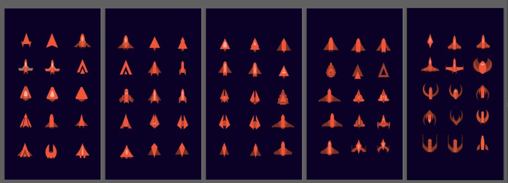
After deciding on the core mechanics of the game, we started working on the art.
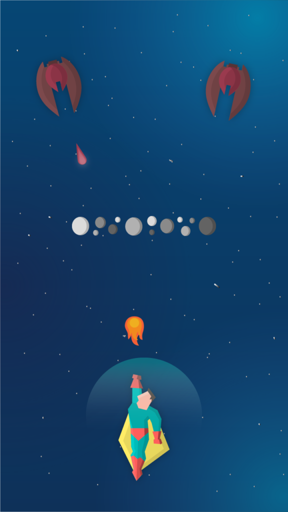
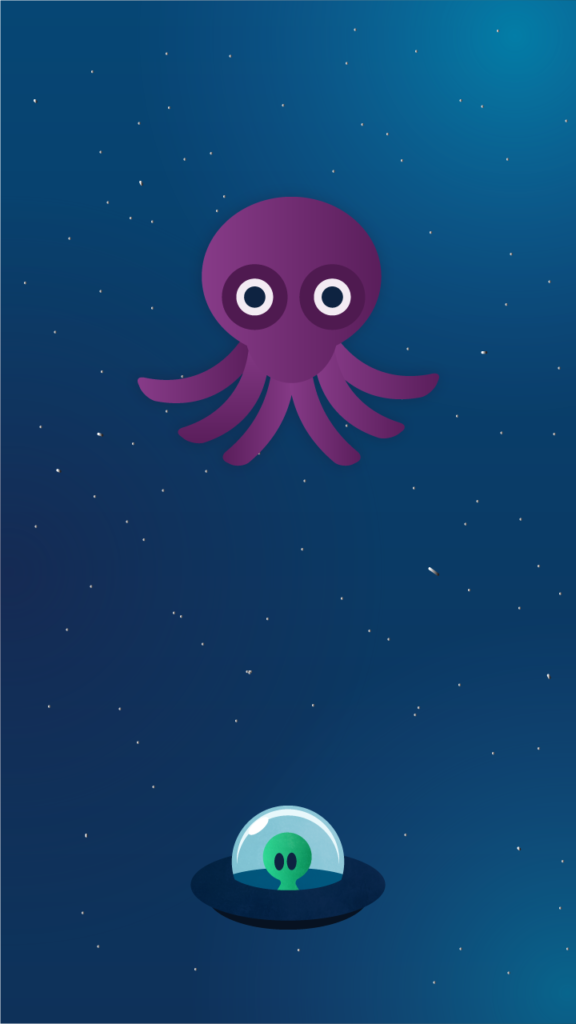
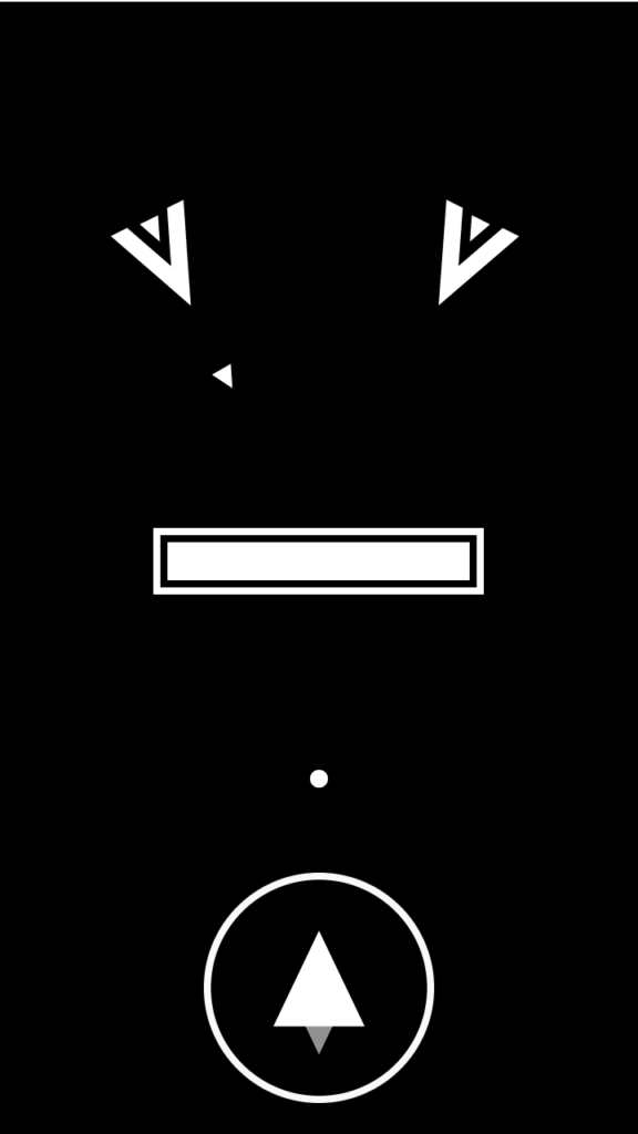
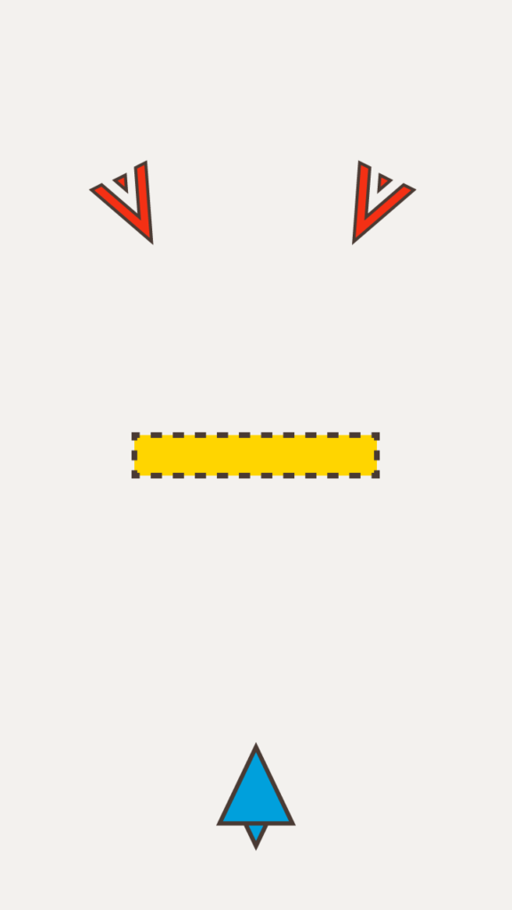
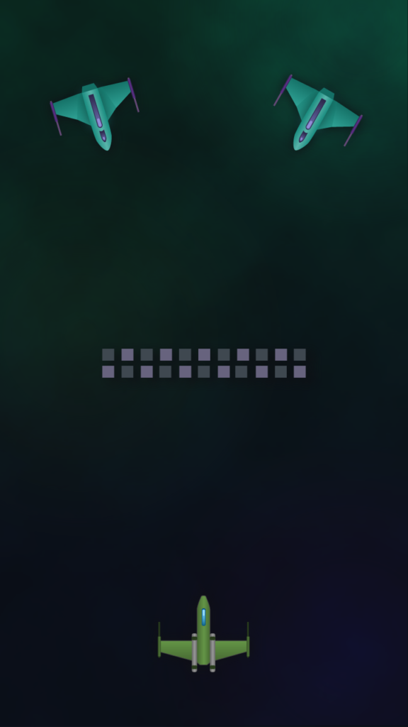
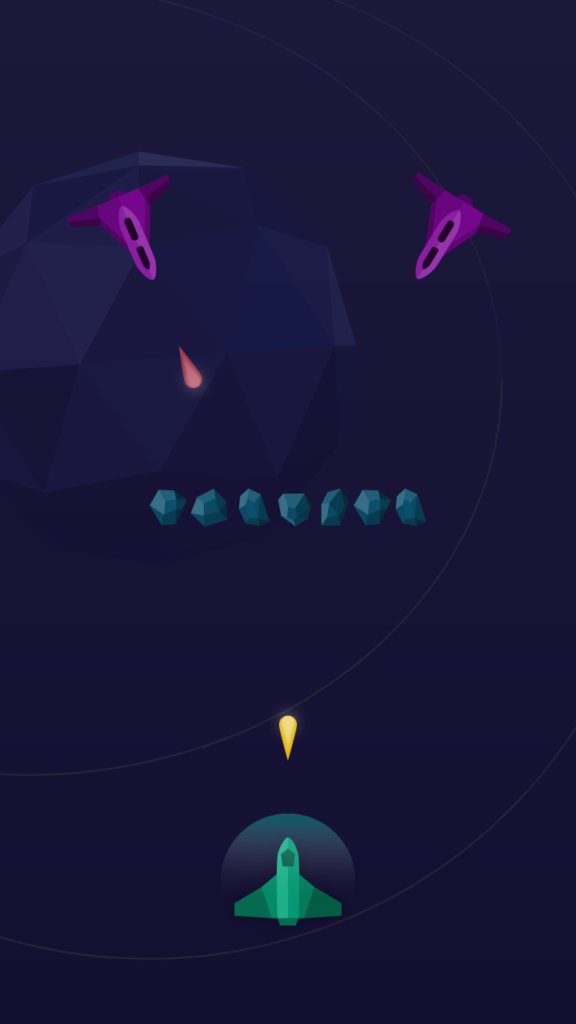
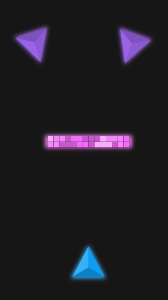
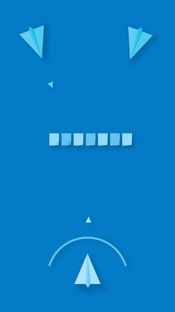
This are some of the styles we tried.
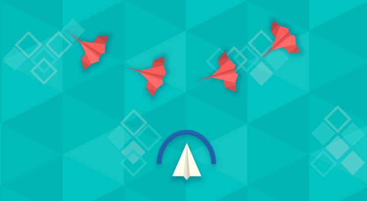
We decided to go with the origami style, because we liked a lot how it looked and we had a lot of ideas for enemies and obstacles. Also because it is a style that makes our game stand out from the rest of shooters games.
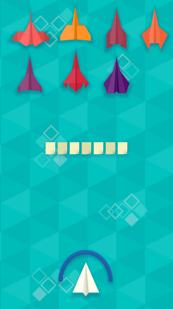
This is how the game looks on the demo
Audio
We are currently using placeholder sound. We tried with different combinations of free sounds, but couldn’t find something exactly as we wanted. We feel that the current space shooter sounds are enough for the demo but we expect to find better audio or hire a professional sound designer for the final game.
Looking for a publisher
Now that we finished the demo, we are going to look for a publisher to fund the rest of the development and help us with PR, advertisement and QA.
